Northeast SHIP
Northeast SHIP
Health & Wellness
What We Made
Branding Identity
Brand Guidelines
Creative Direction
Logo Design
Brand Strategy
UX & Website Design
Website Development
API & Platform Integration
Tags
Challenge
Previously known as Healthy Northland, this organization struggled to represent the seven counties it served as a united front. While banding together helps with grant funding, their work is so localized that an overarching identity often felt off and went unused. Additionally, most of the organization's funding comes from the Statewide Health Improvement Partnership (SHIP), causing external confusion about what Healthy Northland is and its connection to SHIP.
Concept
Through several meetings with the organization's leadership and their on-the-ground teams in the counties they serve, we uncovered key insights. The biggest opportunity to address their challenges was to create a brand system that worked both holistically and at the local level. Our goal was to eliminate the complexity of juggling multiple logos for SHIP, Healthy Northland, and individual county programs. This was creating confusion internally and externally, and streamlining the branding would bring much-needed clarity.
Outcome
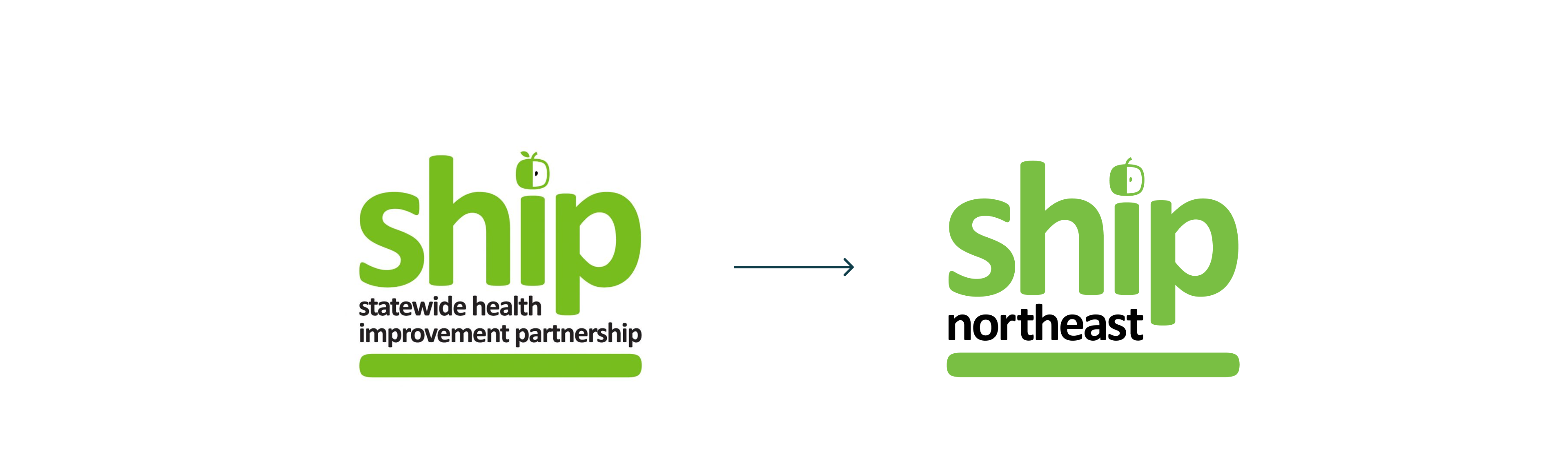
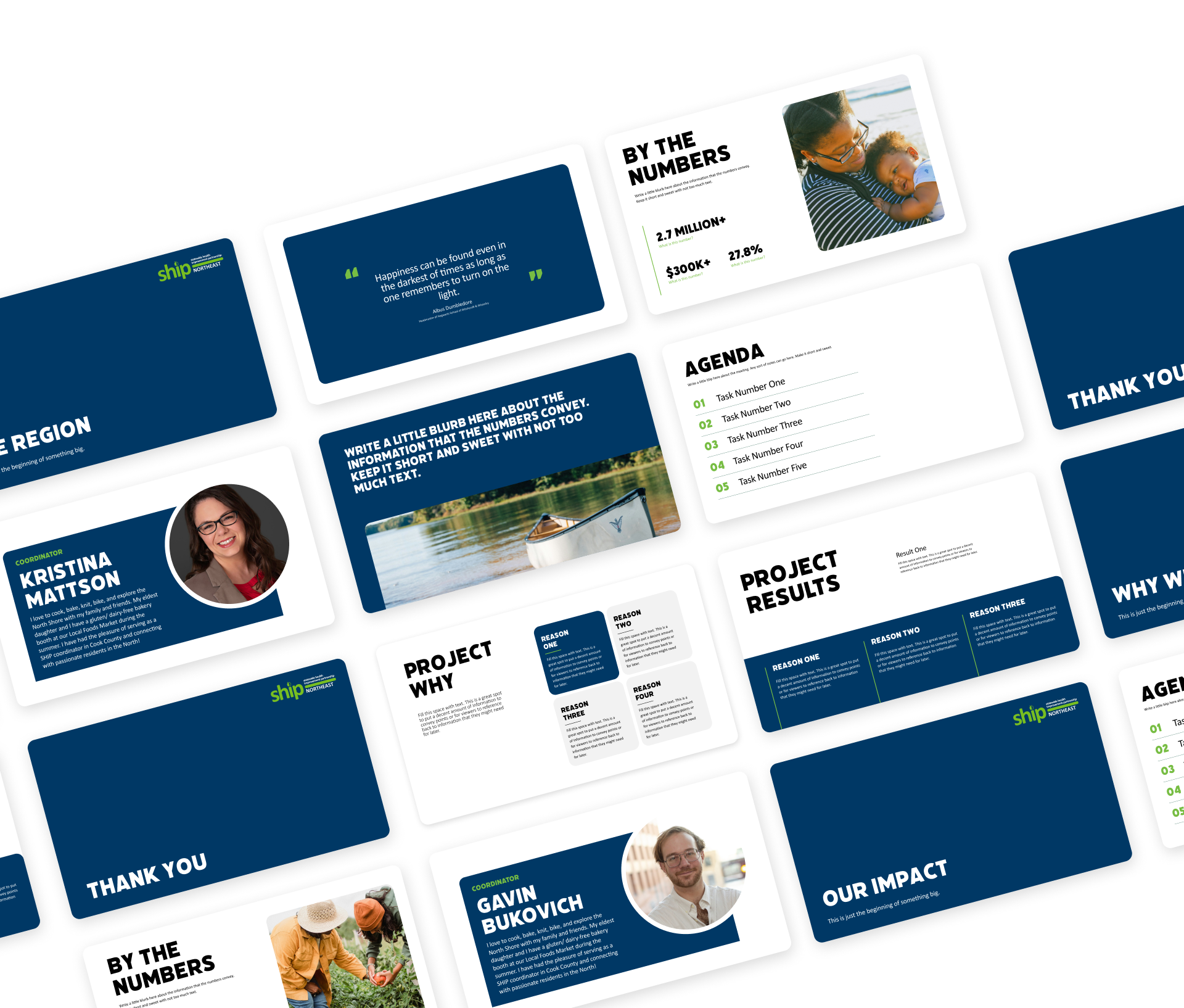
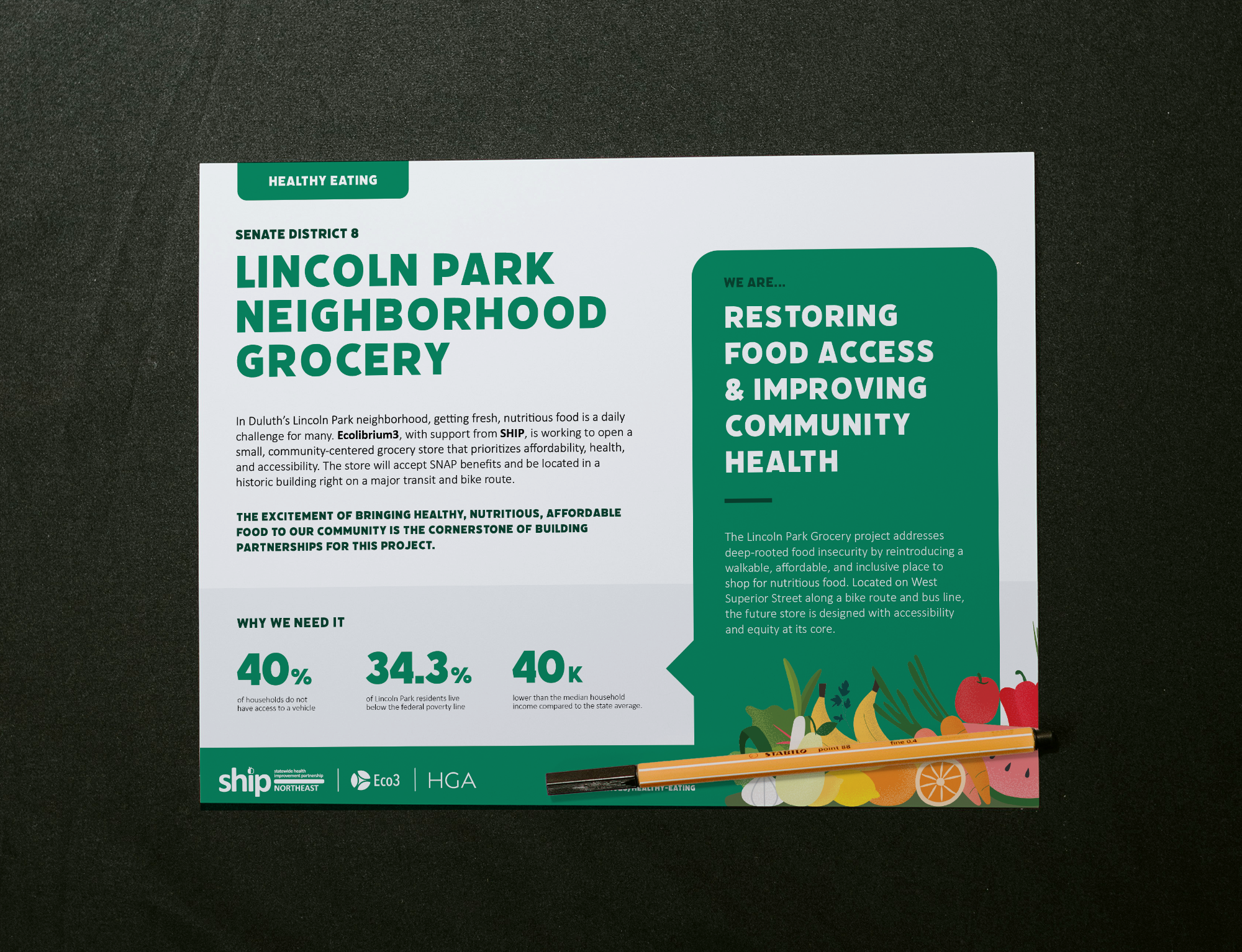
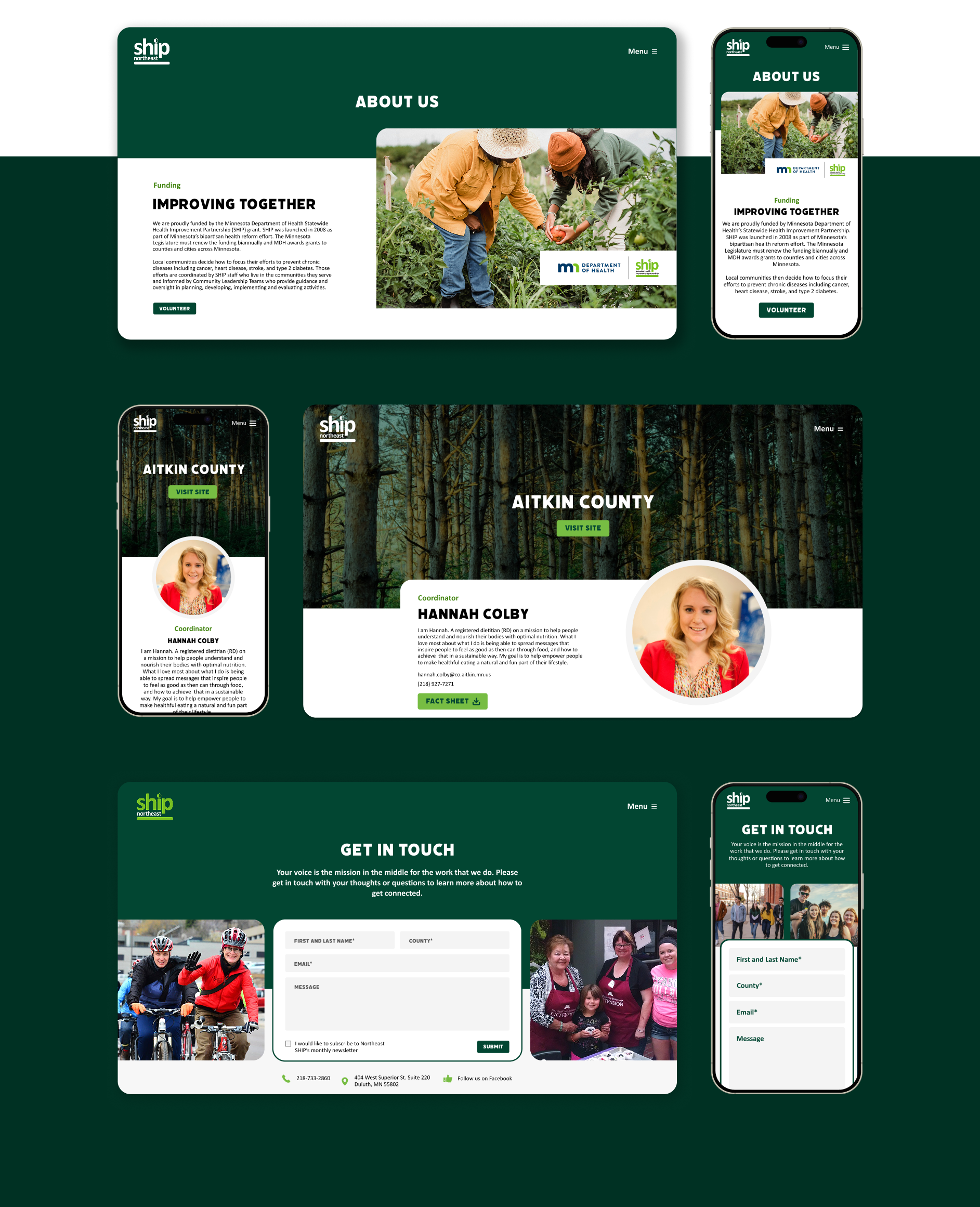
The finished brand system centers on the organization's primary provider, SHIP, and was designed for flexibility, adapting to different audiences and contexts with clear guidelines. The primary regional logo, under the new Northeast SHIP name, represents the organization’s entire service area. County-specific logos were also developed for localized use. Each variation maintains a strong visual connection, ensuring brand recognition and consistency across all applications.

Brand Refresh
Because SHIP initiatives differ by county and stakeholder, communications had become fragmented—leading to confusion about how the work fit together. Through collaborative discovery, we defined a clearer, more cohesive narrative that honors local efforts while positioning Northeast SHIP as a connected, strategic force for community health. A key step was unifying the name and visual identity: inconsistent logos and name variations were replaced with the straightforward, memorable “Northeast SHIP.” With this foundation, we built a flexible brand system rooted in shared values, cross-county impact, and a stronger, unified presence across the region.
What they said and how they felt

What they said and how they felt
What they said and how they felt

What they said and how they felt
Website
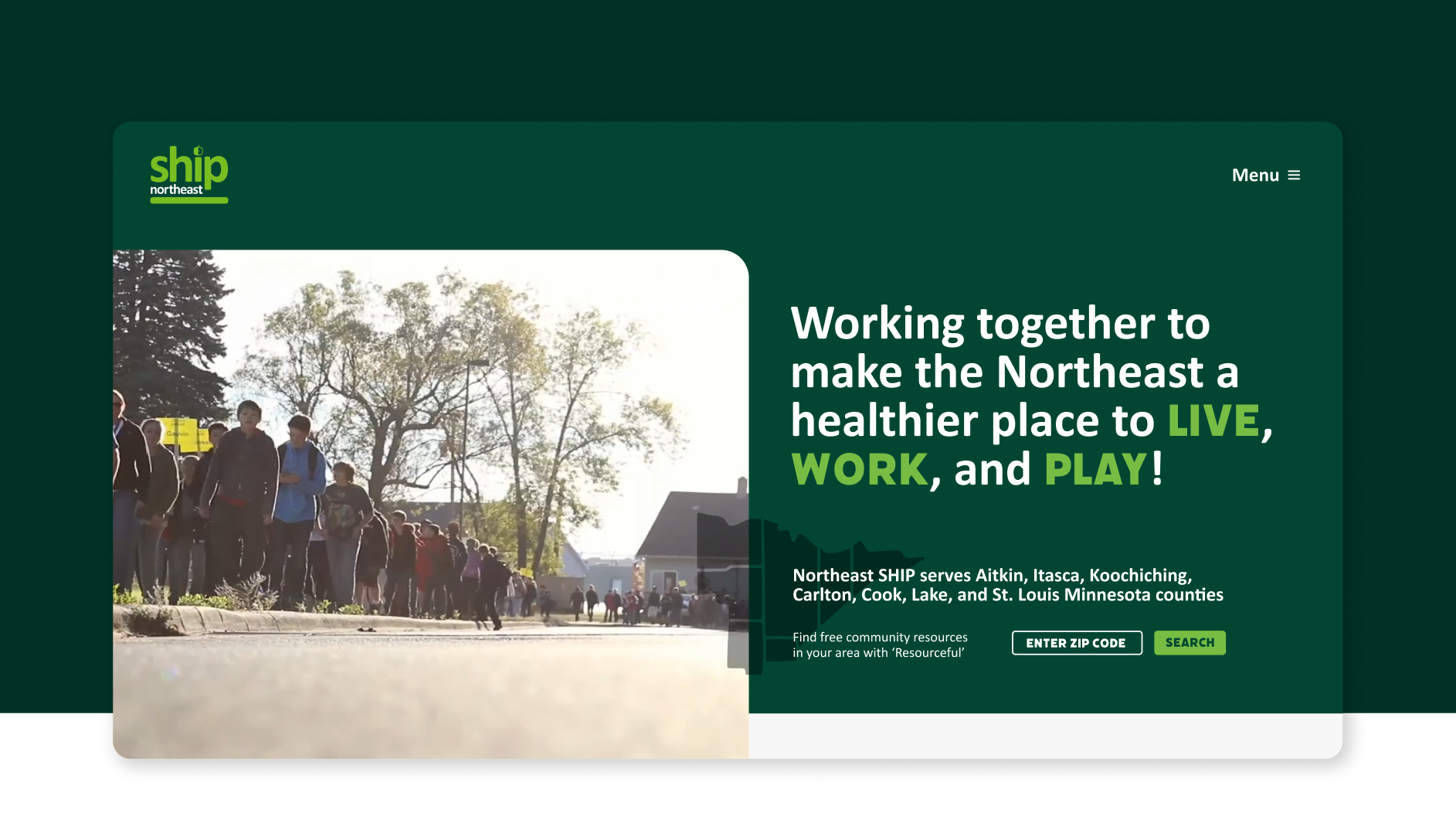
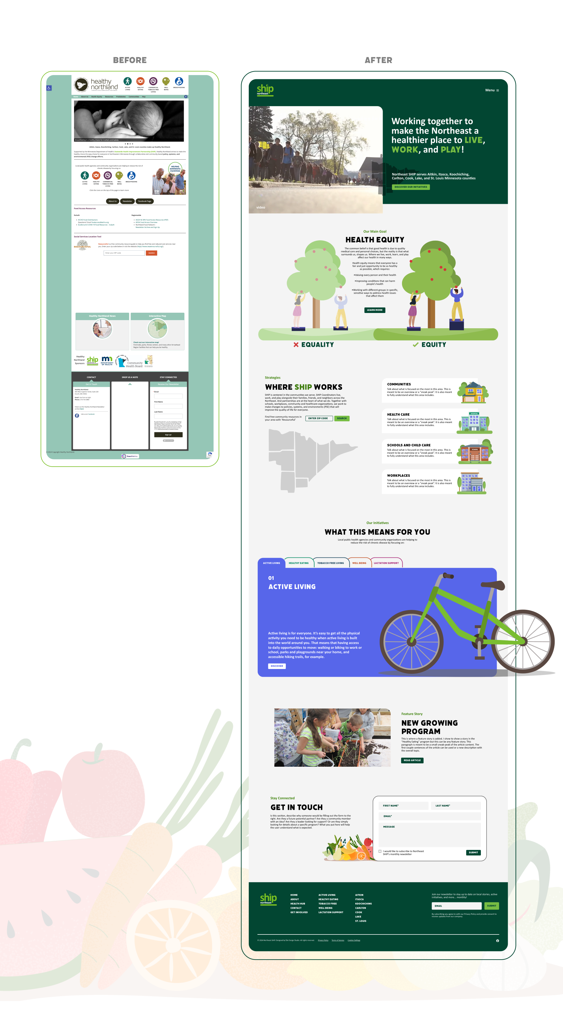
Before the redesign, Northeast SHIP’s website was a semi-functional, patchwork of information that made it difficult for visitors to understand the full scope of their work. Content lived in multiple locations, navigation felt disjointed, and visuals did not reflect the refreshed identity or the energy behind the organization’s mission. It served as a basic repository rather than a tool for engagement or storytelling.
After the rebrand and redesign, the new site is more cohesive, accessible, and visually engaging. The structure now guides users intuitively through initiatives, counties resources, and community news, making SHIP’s regional impact much more tangible and clear. Fresh visuals and approachable language invite visitors to explore, while the flexible backend empowers staff to easily update content as programs evolve. What was once a static, confusing site, is now an engaging platform that connects communities, celebrates collaboration, and reinforces Northeast SHIP’s role as a trusted regional health partner.
What they said and how they felt
What they said and how they felt
What they said and how they felt
What they said and how they felt
What they said and how they felt
More of what we have made
.jpg)
The NorShor Theater

Dorothy Pecaut Nature Center