Two Rivers Counseling
Two Rivers Counseling
Health & Wellness
What We Made
Branding Identity
Brand Strategy
Brand Guidelines
Logo Design
Marketing Collateral
Photo
Creative Direction
Tags
Challenge
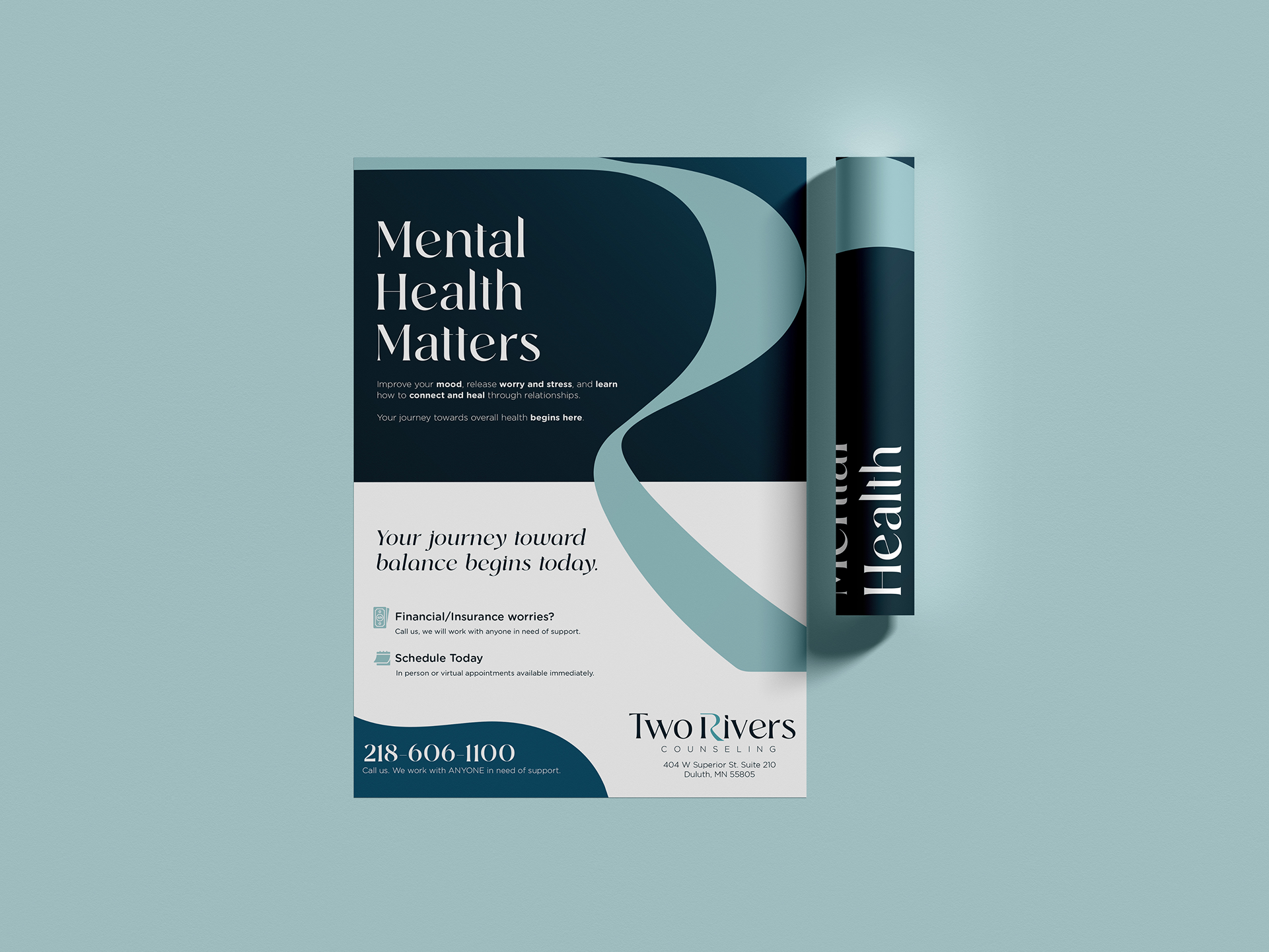
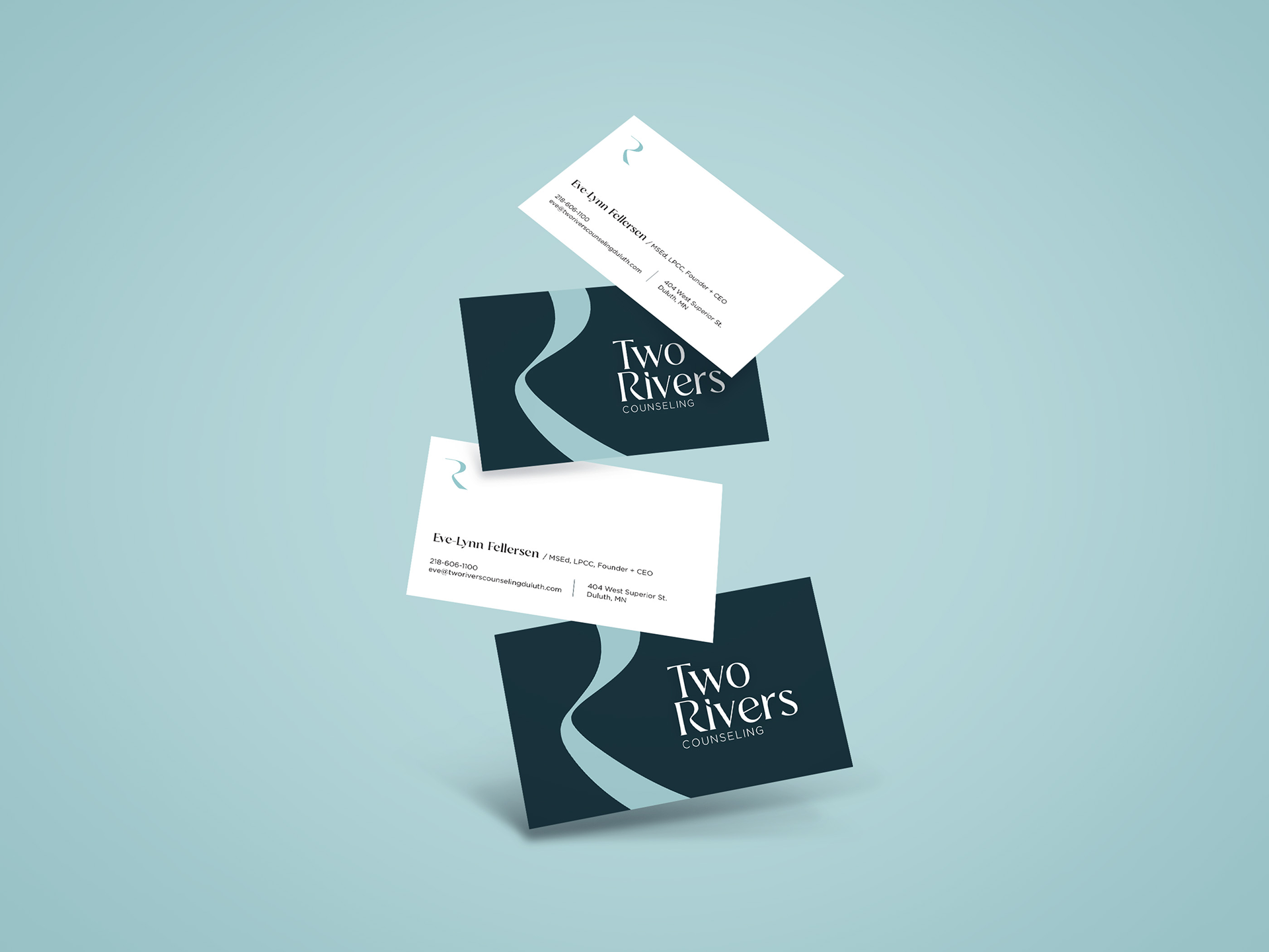
With growing awareness of mental health services and increased competition from other therapy providers in the area, Two Rivers Counseling recognized it was time for a rebrand. Their existing identity felt outdated and didn’t clearly set the practice apart. The goal was to develop a counseling branding system that would refresh the logo, differentiate the practice, and provide a cohesive identity that could be applied across all client touch points and marketing materials.
Concept
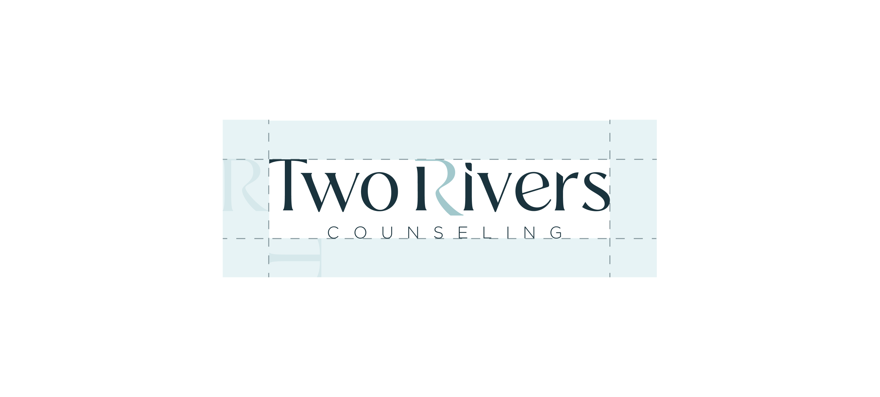
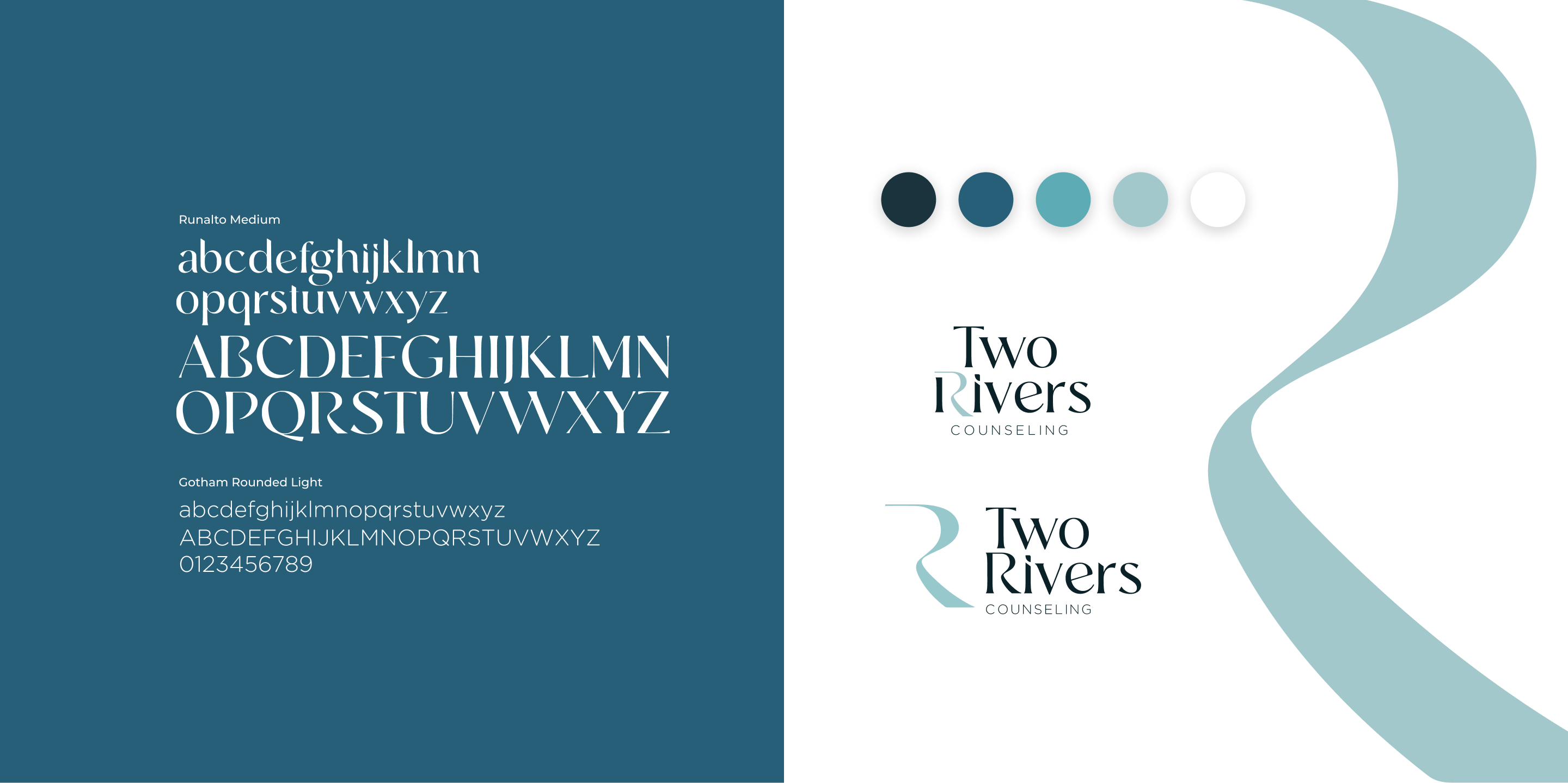
The counseling branding concept centered on creating a clean, approachable wordmark with an organic flow that reflects the business name. The custom icon represents both the letter “R” and a river, offering flexibility as part of the logo or as a standalone graphic element across the brand. A cool, calming color palette was selected to evoke the supportive, peaceful environment Two Rivers Counseling strives to create for clients.
Outcome
The finalized counseling branding was implemented across brand guidelines, the website, business cards, letterhead, social media templates, and printed marketing materials. We also supported the rollout with new headshots and team photography, resulting in a cohesive, professional brand presence that reflects the values and experience of Two Rivers Counseling.
Brand Identity System
The Two Rivers Counseling rebrand focused on creating a calm, distinctive counseling brand that feels approachable and supportive. A clean wordmark with organic flow, paired with a custom icon representing both an “R” and a river, reflects the practice’s name and values. The cool, soothing color palette reinforces the peaceful environment Two Rivers aims to provide, resulting in a cohesive identity that works seamlessly across digital and printed touch points.


What they said and how they felt

What they said and how they felt

What they said and how they felt
What they said and how they felt
Marketing Materials
The new brand was applied across a suite of marketing materials designed to create consistency and recognition at every touchpoint. Business cards, letterhead, social media templates, and other printed materials were developed in alignment with the updated identity, along with new team photography, ensuring a cohesive and professional presence across both digital and in-person interactions.
What they said and how they felt
What they said and how they felt

What they said and how they felt
What they said and how they felt
More of what we have made

True North Orthodontics

Grand Marais Art Colony | Website