
Victory Chorus
Victory Fund
Non Profits
What We Made
Branding Identity
Brand Guidelines
Brand Strategy
Logo Design
API & Platform Integration
UX & Website Design
Website Development
Tags
Challenge
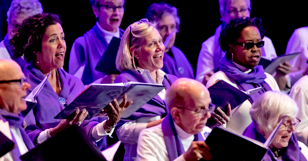
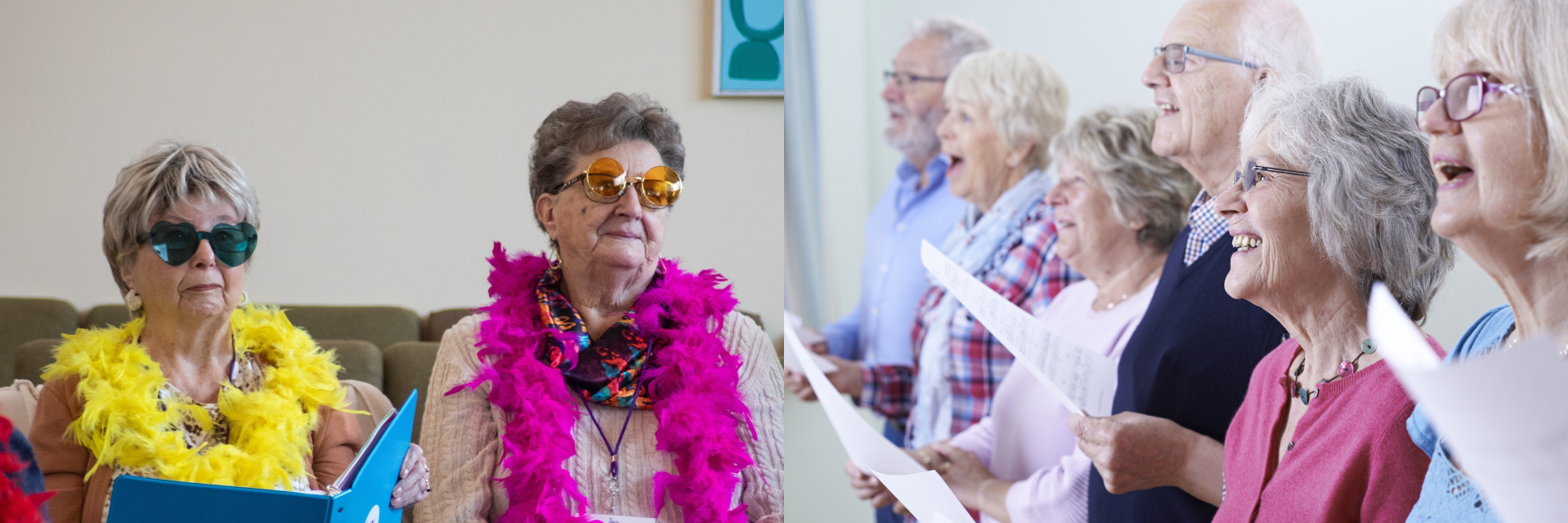
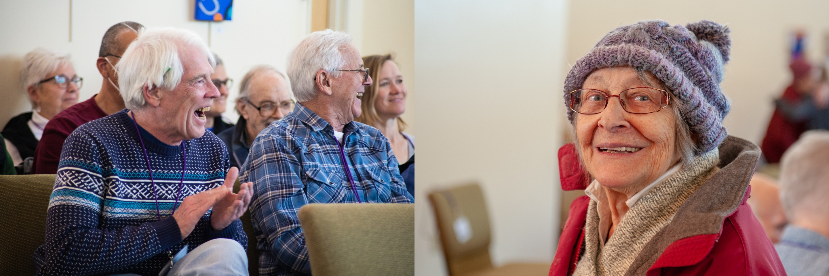
The Victory Chorus provides a safe, loving, and supportive space that welcomes people living with dementia to engage in their community, build connections, use their gifts, and experience joy. Put simply, they ultimately want to uplift spirits through song. But they felt that their brand was outdated and lacked the ability for their internal team to use it easily across different promotional and communication pieces.
Concept
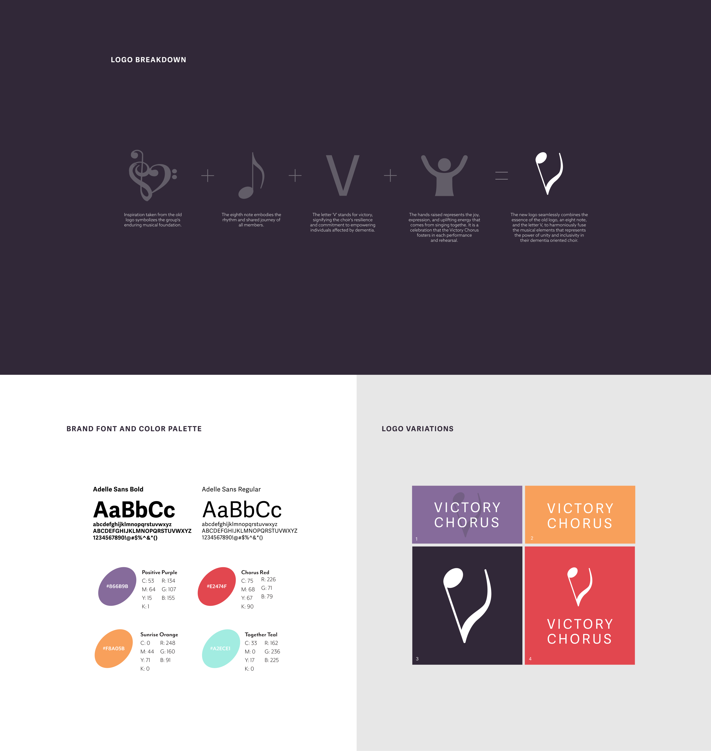
We first started by gaining a strong understanding of the organization, reviewing the Victory Chorus' brand, and completing industry research. We determined that our main goals with the rebrand was to simplify the logo and create a wholistic brand system the organization would be able to use flexibility for years to come. We drew inspiration from the old logo, pulling out the symbolization of the organization's enduring musical foundation as well as connection to the Chorus' parent organization, The Victory Fund.
Outcome
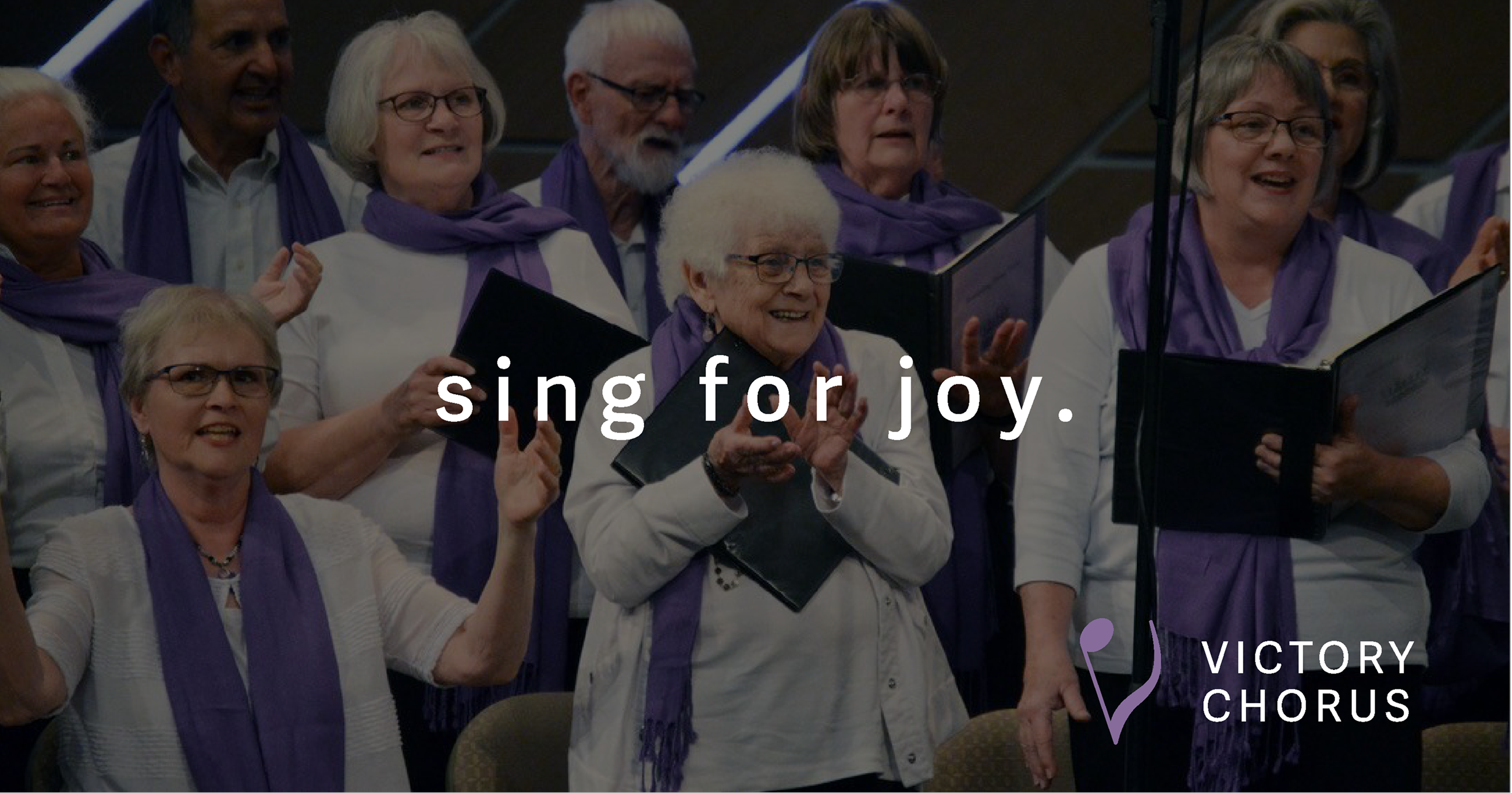
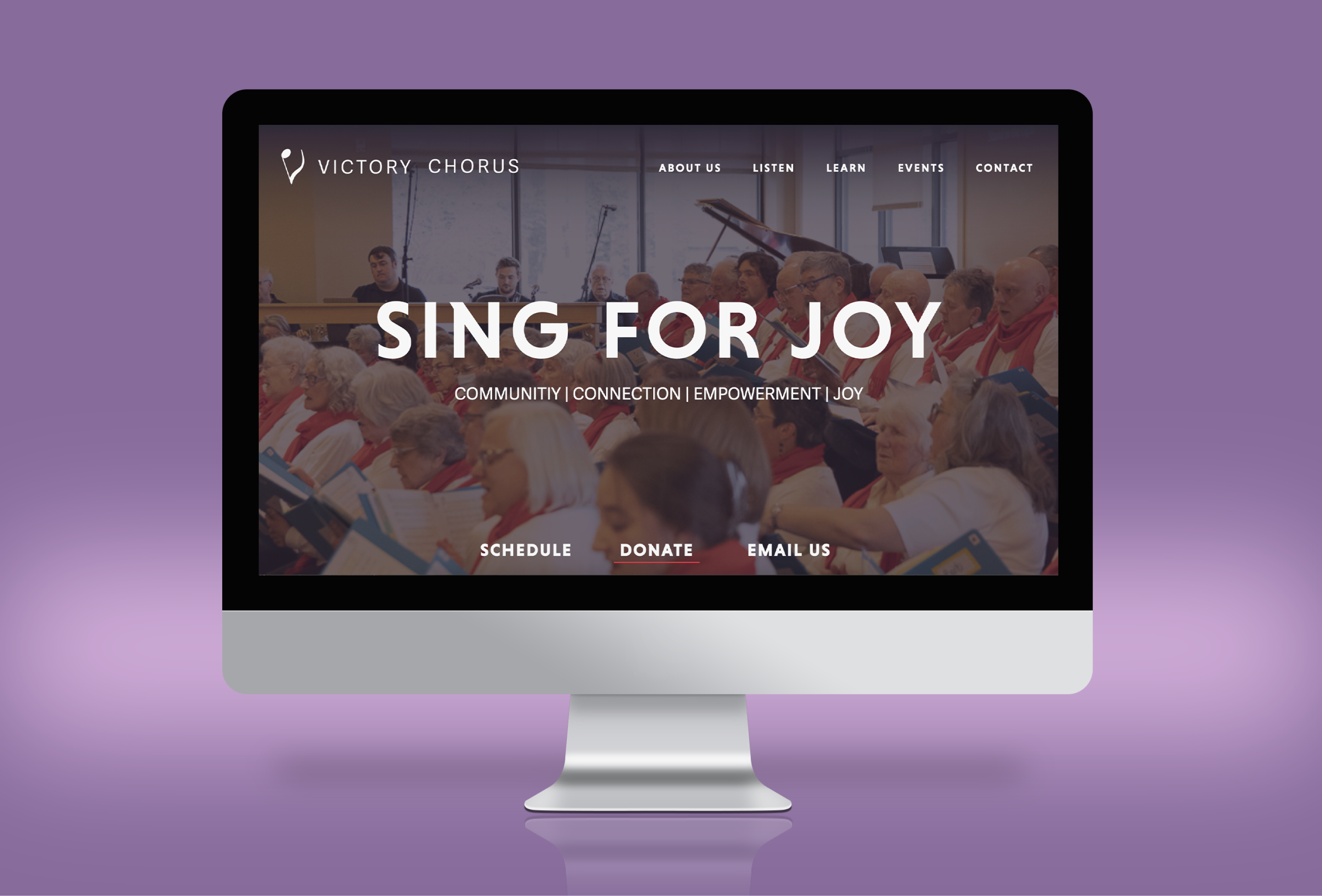
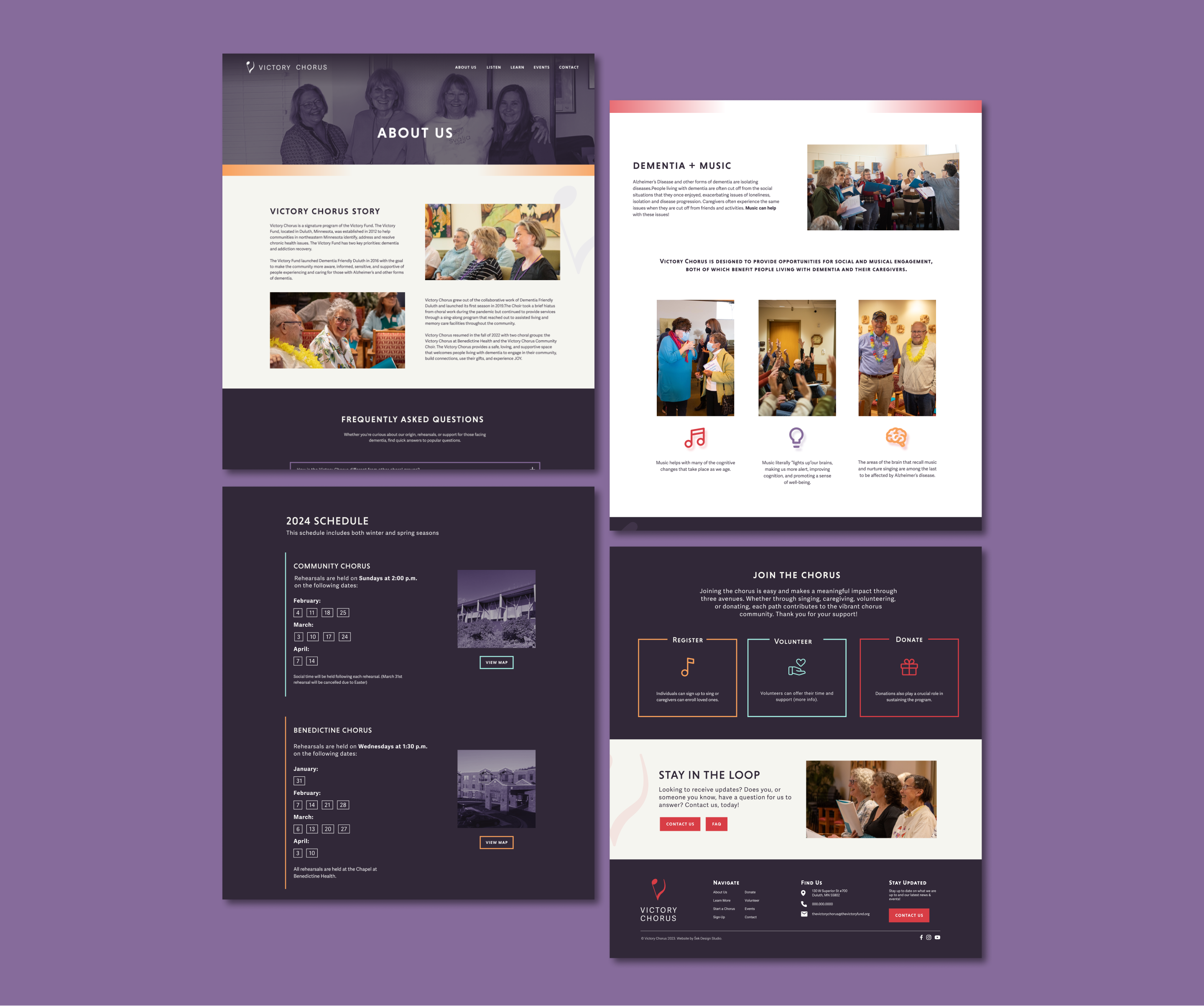
The final logo utilizes an eighth note to embody the rhythm and shared journey among members. The letter V stands for victory. signifying the choir's resilience and commitment to empowering individuals affected by dementia. The logo also symbolizes hands raised overhead in a joyful and uplifting energetic expression that comes from singing together. It is a celebration that the Victory Chorus fosters in each performance and rehearsal. Together the new brand harmoniously fuses elements of music with the power of unity and inclusivity to create the wholistic brand system you see below. The new particularly came to life on the Victory Chorus' website, which was thoughtfully designed with the Victory Chorus' older audience and accessibility in mind.
A Brand That Celebrates Joy, Music, and Community
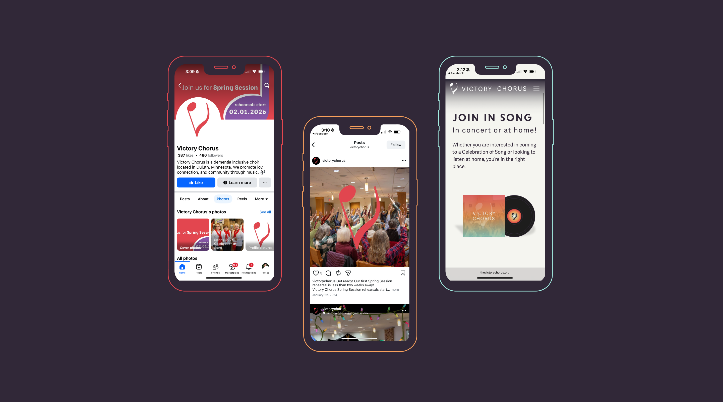
The Victory Chorus rebrand was centered on creating a visual identity that reflects the chorus’s mission of connection, joy, and community through music. We focused on distilling the emotional and musical essence of the organization into a clear, approachable brand system. This included developing a meaningful logo that unites musical symbolism with a sense of victory and uplifting expression, selecting accessible typography and color, and designing materials that support the chorus’s outreach and storytelling across digital and print touchpoints.

What they said and how they felt

What they said and how they felt
What they said and how they felt
A Website Built for Connection and Accessibility
The Victory Chorus website was designed and developed to support clarity, accessibility, and ease of use for a diverse audience. We focused on creating a welcoming digital experience that reflects the warmth of the chorus while making information easy to find and engage with. The site’s structure, visuals, and content were thoughtfully crafted to support storytelling, outreach, and ongoing community connection.
What they said and how they felt
What they said and how they felt
What they said and how they felt
What they said and how they felt
What they said and how they felt
More of what we have made

Montgomery Sports Foundation

Duluth Playhouse | Rebrand + 2022-23 Season