Brightwater Health
Health & Wellness
What We Made
Branding Identity
Naming
Brand Strategy
Branding Identity
Design
Marketing Collateral
UX & Website Design
Tags
Challenge
Human Development Center (HDC) recognized the need for a healthcare rebrand that better reflected who they are and how they deliver care. Their existing name and visual identity no longer aligned with their person-centered, modern approach or the breadth of services they provide. The organization needed a new name and brand system that felt welcoming, clear, and adaptable across diverse audiences and touchpoints—while maintaining trust and continuity within the community they serve.
Concept
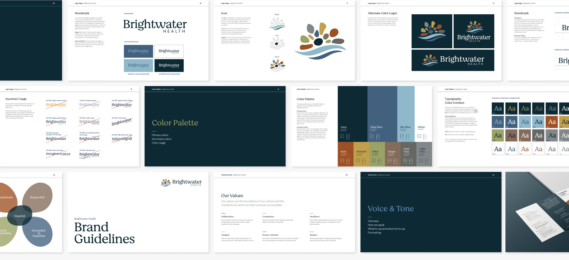
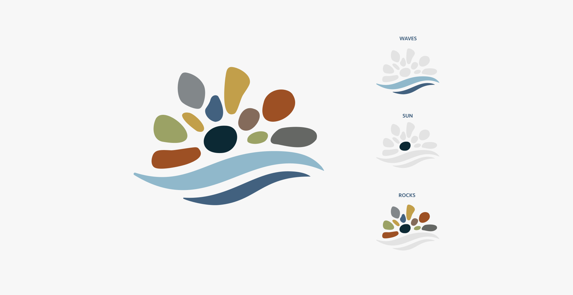
We partnered with HDC to guide a thoughtful healthcare rebrand, beginning with a new name: Brightwater Health. The name evokes clarity, flow, and care—reflecting the organization’s supportive approach to health and human services. Drawing inspiration from the natural beauty of the surrounding region, the logo and visual identity incorporate elements that feel grounded, calming, and connected to place. Building on this foundation, we developed a flexible brand system designed to grow with the organization. The visual language emphasizes warmth, accessibility, and cohesion, allowing Brightwater Health to communicate consistently across print, digital, and environmental applications.
Outcome
The completed healthcare rebrand provided Brightwater Health with a cohesive, future-ready identity that clearly expresses their mission and values. The new brand system served as the foundation for brochures, signage, interior building elements, digital assets, and a redesigned website that improves user experience and highlights the organization’s care-focused approach. With a clear name, refined visuals, and unified brand system, Brightwater Health is positioned to better connect with patients, families, and the broader community.


The New Face of HDC
Brightwater Health’s new brand reflects a thoughtful evolution from Human Development Center (HDC) to a name and identity that better express the organization’s person-centered, modern approach to care. Rooted in clarity, warmth, and accessibility, the brand was designed to feel welcoming and adaptable while maintaining trust within the community. The refined logo and flexible identity system provide a cohesive foundation across print, digital, and environmental applications—positioning Brightwater Health as a clear, compassionate, and future-ready healthcare provider.


What they said and how they felt


What they said and how they felt


What they said and how they felt


What they said and how they felt
Making a Plan
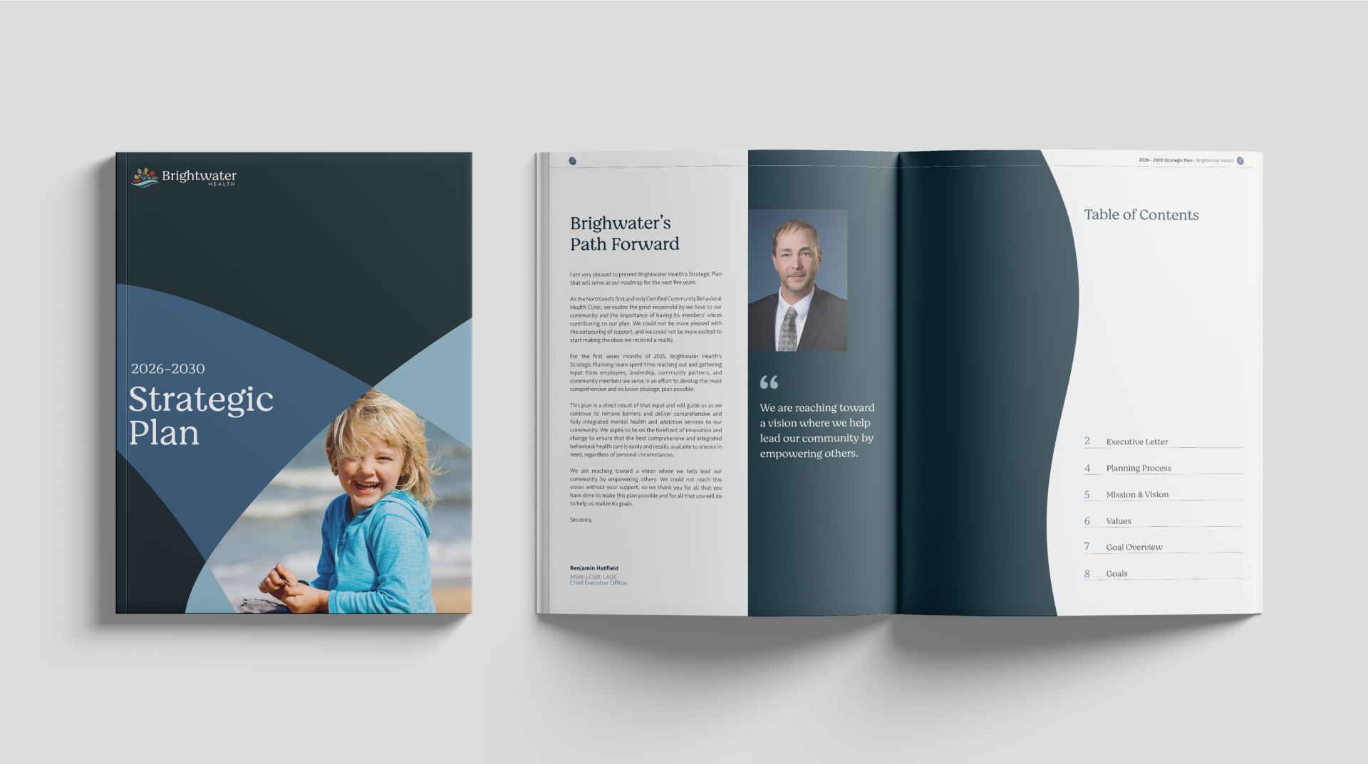
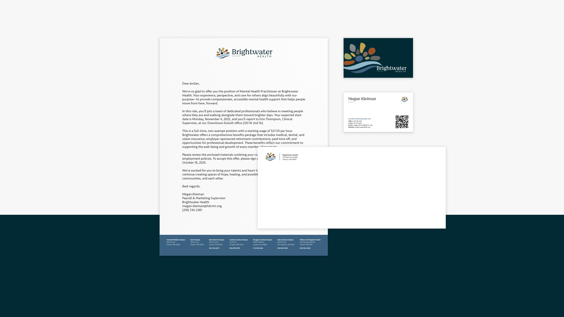
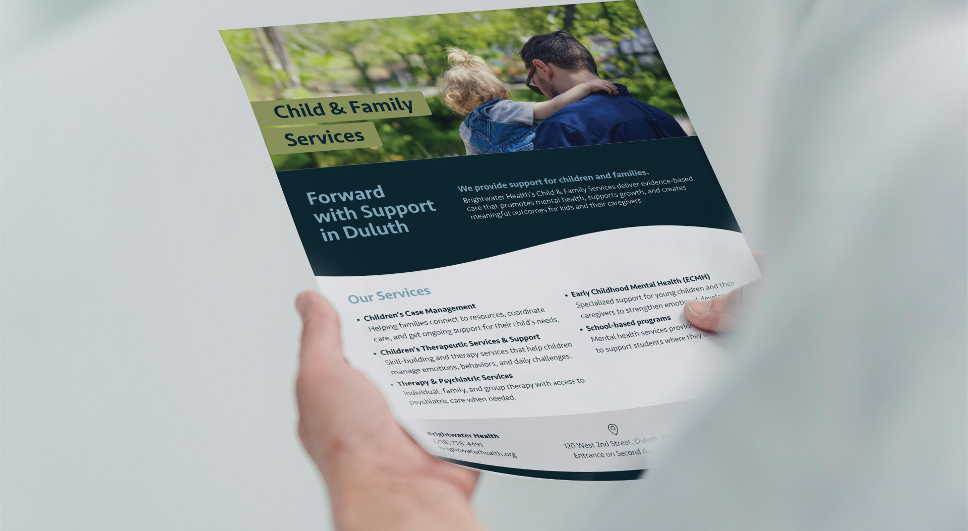
The Brightwater Health brand was intentionally designed as a flexible system that works seamlessly across both digital and print applications. Clear brand guidelines, adaptable design elements, and a cohesive visual language allow the identity to scale across websites, brochures, signage, and internal materials. This flexibility ensures consistent, recognizable communication while giving Brightwater Health the tools to evolve and apply the brand confidently across every touchpoint.


What they said and how they felt


What they said and how they felt


What they said and how they felt


What they said and how they felt


What they said and how they felt
Communication That Cares
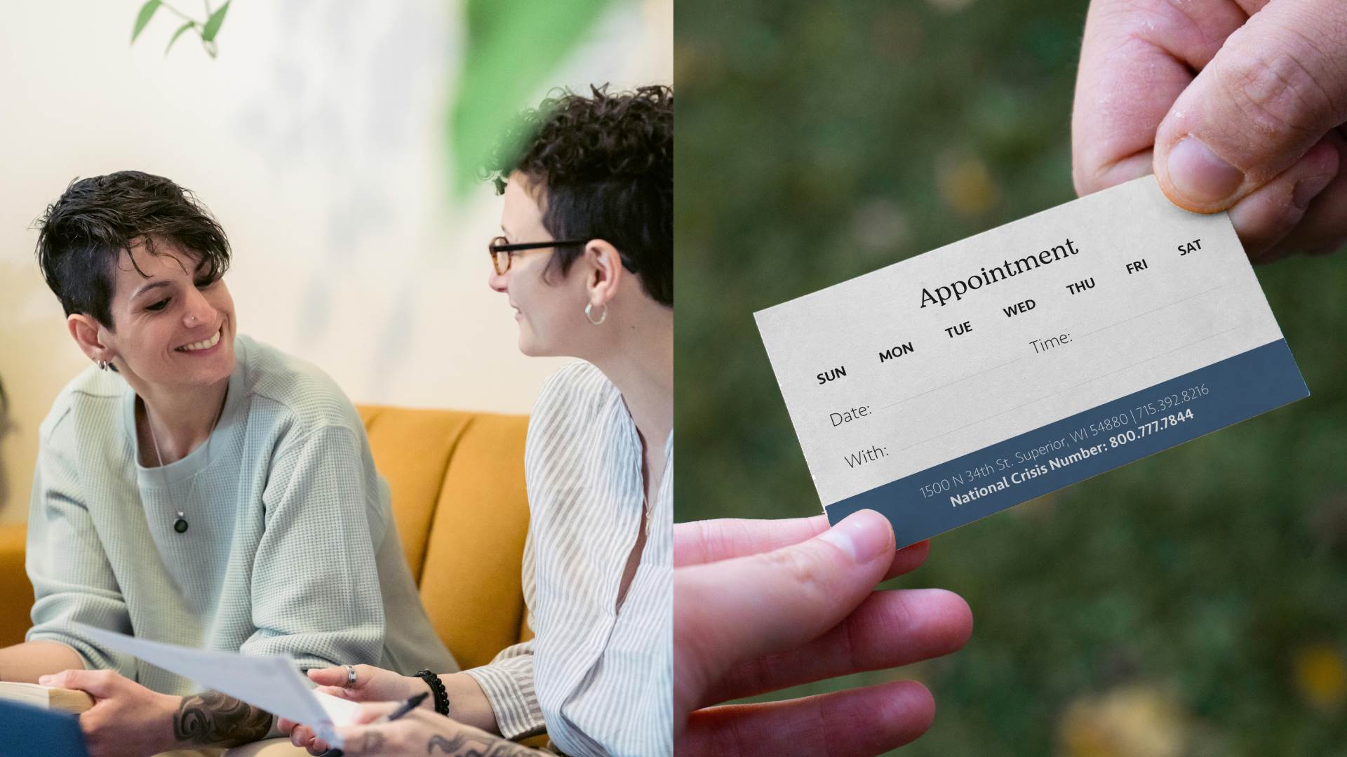
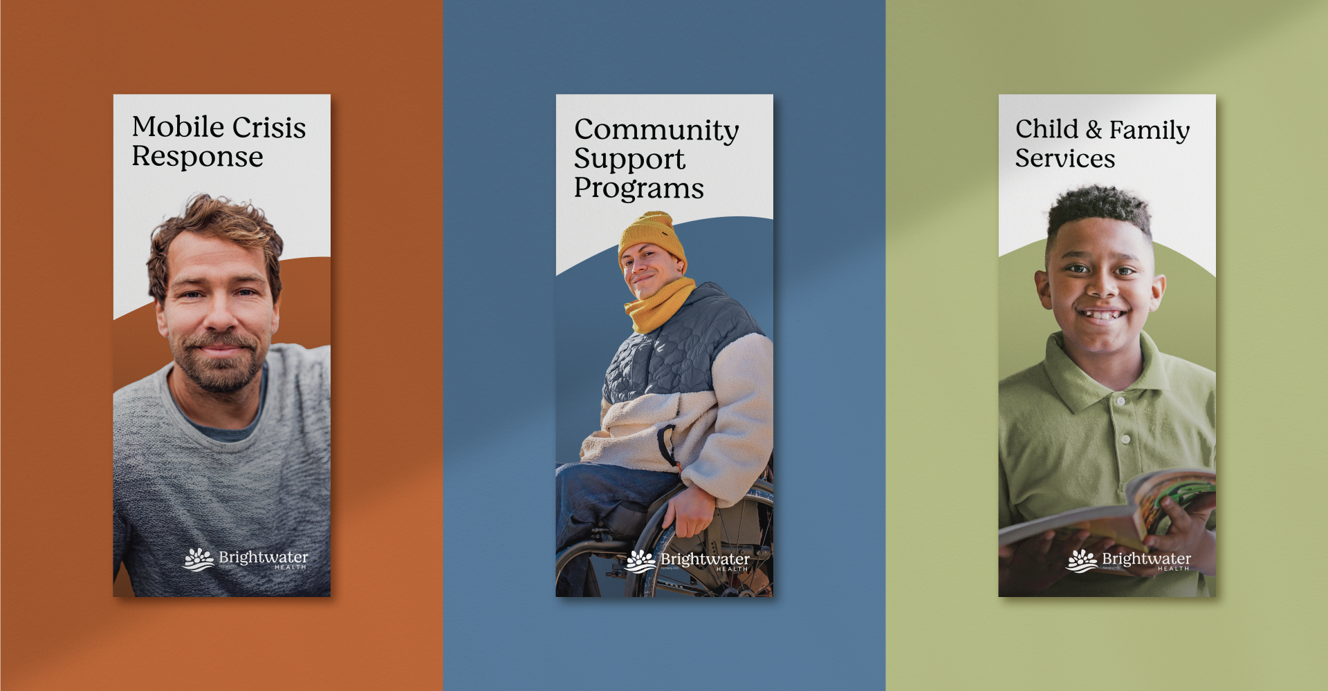
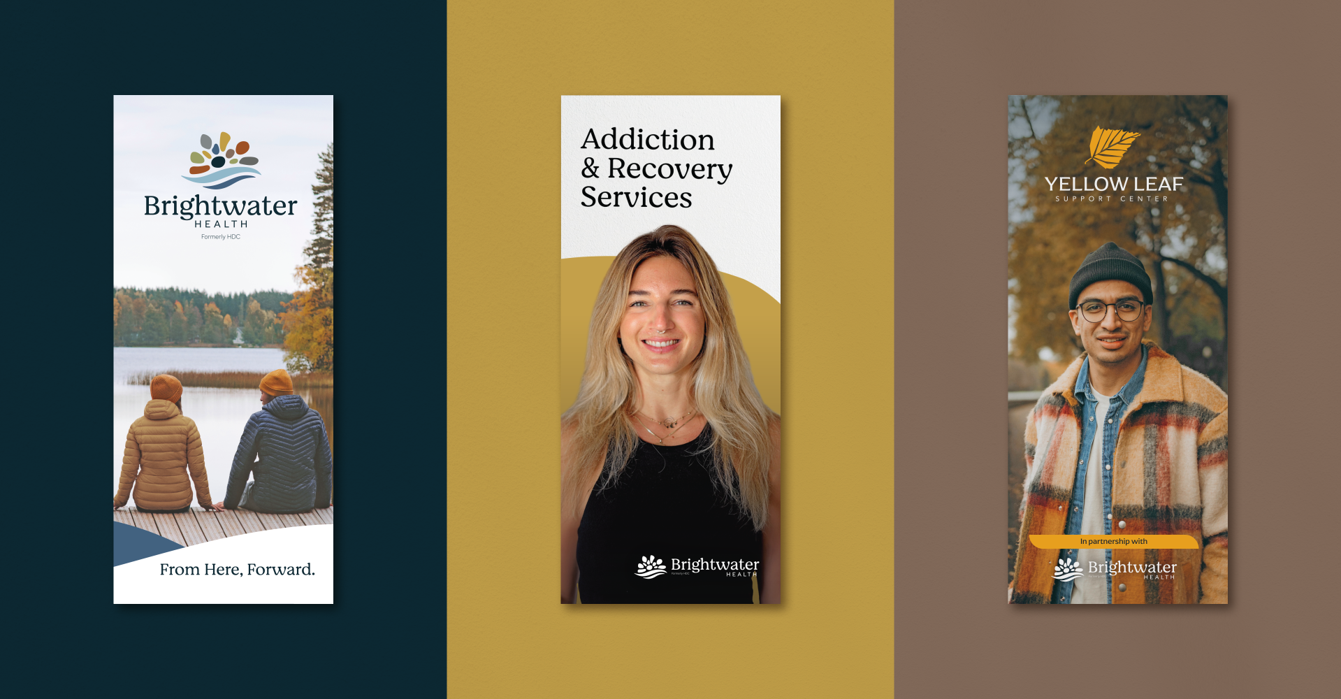
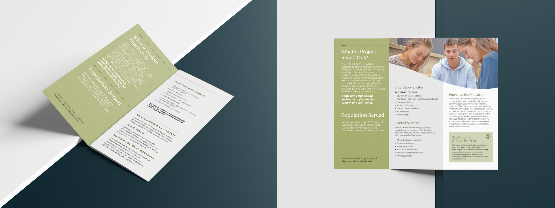
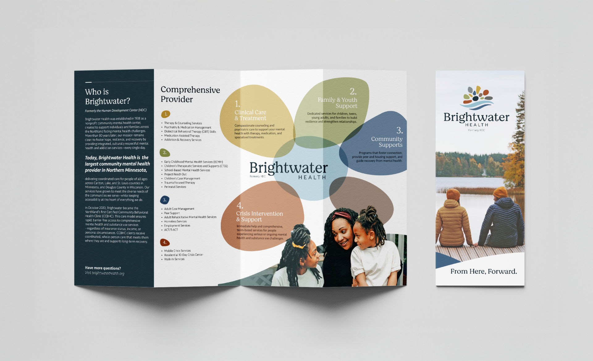
We reimagined Brightwater Health’s suite of brochures to make the organization’s full breadth of services easier to understand and navigate. Through clear structure, approachable design, and thoughtful messaging, the materials help individuals identify which services are right for them and clearly outline next steps—creating a more supportive, informative experience that reflects Brightwater’s commitment to accessible, person-centered care.


What they said and how they felt


What they said and how they felt


What they said and how they felt


What they said and how they felt
Spaces That Heal
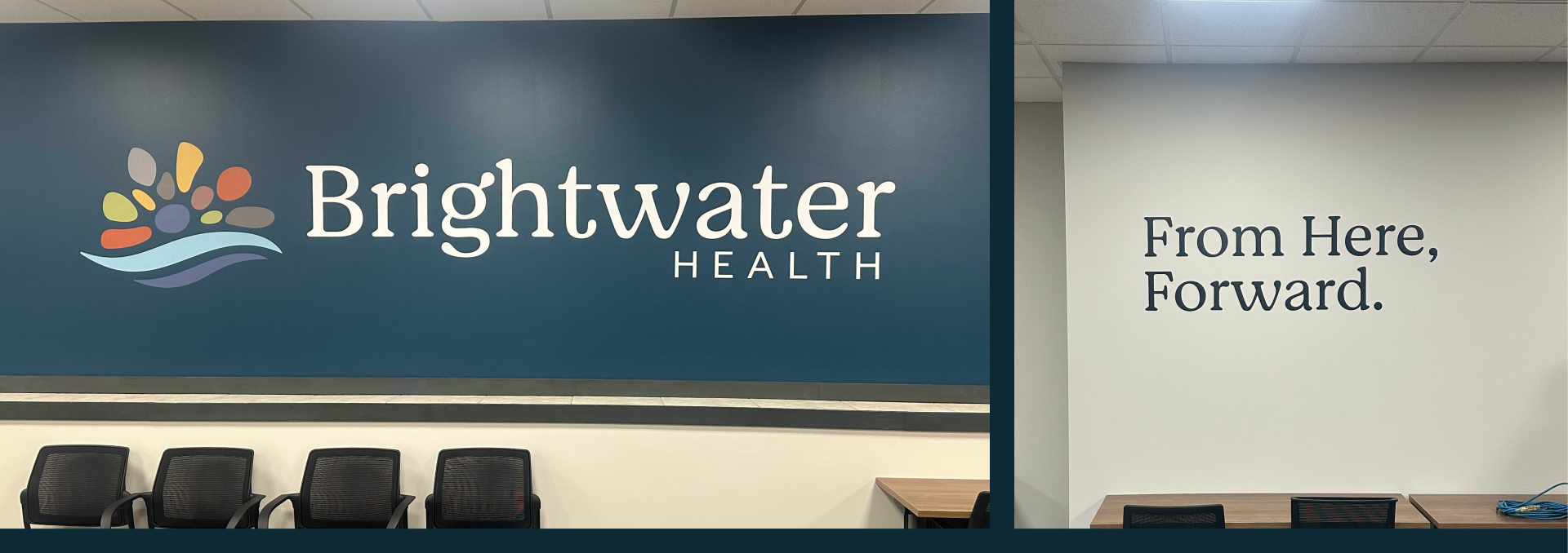
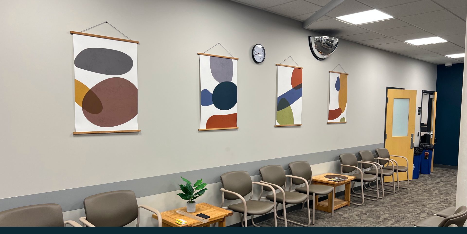
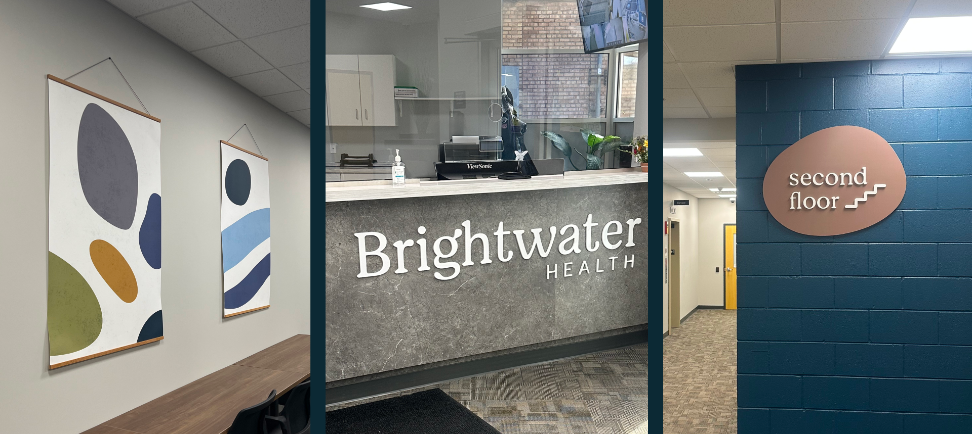
We extended the Brightwater Health brand into the organization’s physical spaces by applying the new visual identity to building signage and interior environments. The warm color palette, approachable typography, and clear wayfinding were designed to create a welcoming, calming experience for patients, families, and visitors—helping the brand come to life in a way that supports comfort, clarity, and care from the moment someone enters the space.


What they said and how they felt


What they said and how they felt


What they said and how they felt



What they said and how they felt
What they said and how they felt
More of what we have made

Minnesota Ballet
.jpg)
The NorShor Theater


