Duluth Children's Museum
Duluth Children's Museum
Non Profits
What We Made
Branding Identity
Brand Guidelines
Creative Direction
Design
Interior & Exterior Store Design
Marketing Collateral
Logo Design
Video
Video Production
Photo
Tags
apparel
branding
business cards
childrens
clothing
dcm
digital
duluth
enviornment
exterior
letterhead
logo
meaning
non profit
photography
rebrand
shirts
sign
signage
social
system
Challenge
Established in 1930, the Duluth Children’s Museum was — and still is — the only cultural resource in the Northland that is exclusively designed to meet the developmental needs of young children. They have a long past, but also a strong goal for the future. Their ultimate aim today is to establish a sustainable location and a recognizable brand that helps them continue the work they do for generations to come. Dissatisfied with their outdated pinwheel logo, seen as simplistic and clip art-like, the museum initiated a rebranding process alongside Šek to coincide with their relocation in 2020.
Concept
The museum's mission is to engage children in hands on learning through creative play and interactive exhibits. They wanted the new Children's Museum branding to really speak to that aspiration. They value play, discovery, exploration, imagination and community. It's a lot to convey within a brand, but we were up for the challenge.We developed and tested out a lot of concepts. We knew we wanted to infuse bright, bold colors.
Outcome
Through our close partnership with the Children's Museum to make sure all the pieces they'd need for incorporating their new brand were created. We crafted logo variations, visitor passes, letterhead, digital assets, and more. A comprehensive brand guideline booklet was made to ensure consistency within any future use of the brand. As for the Children's Museum's new space, we brainstormed and designed exterior changes, signage, and interior designs. After implementation, we provided a library of photos for future use and have since continue to partner with the Museum for further marketing and design needs.
It always so much fun for us when we get to work on brands that we're the target audience for! It helps us dig even further and create designs that would stop us in our tracks if we came across them. With several parents of young kids on our team, we cannot tell you what a blast we had working on the Duluth Children's Museum branding.Even without kids, we still would have had a lot of fun. The Duluth Children's Museum is steeped in history and an admirable aim to serve the community. Established in 1930, Duluth Children’s Museum was — and still is — the only cultural resource in the Northland that is exclusively designed to meet the developmental needs of young children. They have a long past, but also a strong goal for the future. Their ultimate aim today is to establish a sustainable location and a recognizable brand that helps them continue the work they do for generations to come.
The Big Move
Speaking of location. That's what was the major spark for rebranding. They've been less than thrilled with their branding for quite some time. They felt that their old pinwheel was a bit outdated and simplistic. Some employees even thought it looked a little clip arty.Well in 2020 they finalized plans to move out of their rented space and into a place of their own that they could completely transform into a play haven. The move got talks of a rebrand in motion as no one really wanted to put the old pinwheel logo on their new building.That's where Šek (happily) entered the picture.
Duluth Children's Museum Branding
The museum's mission is to engage children in hands on learning through creative play and interactive exhibits. They wanted the new Children's Museum branding to really speak to that aspiration. They value play, discovery, exploration, imagination and community. It's a lot to convey within a brand, but we were up for the challenge.We developed and tested out a lot of concepts. We knew we wanted to infuse bright, bold colors. However, we didn't want the colors to be your classic, and expected, primary colors. We wanted them to be unique enough so they could help bring recognition to the museum, which is why we landed on the fun color platte you see below.Since the museum is all about movement and exploration, we developed the new brand to be full of playful shapes. You'll see that the shapes make up the letters D, C and M. More than that, though, they also move around in lively ways depending on where they're used. These shapes opened up the branding to all sorts of fun ways the brand can be incorporated. We even developed ways for them to be physical parts of the museum and exhibits!
Brand Rollout
Creating a new brand is one thing. It's a whole other thing to roll it out across every place a business is present. We worked in close partnership with the Children's Museum to make sure all the pieces they'd need for incorporating their new brand were created. We started with the numerous logo variations, museum passes, letterhead, envelopes, business cards, digital assets, and the like. The first phase of new brand elements also included a brand guideline document. In it, we explain the nuances of the brand (colors, fonts, brand usage, etc.). So anyone implementing the brand will clearly understand how it should be used. Which, of course, helps keep consistency in tact, and consistency is key to building brand recognition as well as credibility.Additionally, the Museum had the benefit (and I'm sure, challenge) of having a whole new space that was a blank canvas for implementing the new brand. We enjoyed brainstorming and mocking up options for new exterior changes that could be made to the building itself, window displays, door decals, signage, the works. We also created designs for interior signs, interactive brand pieces, shirts, and a new brochure.Once everything was all in place, we photographed the new space so the Children's Museum would have a large library of photos to use in future promotion or customer communications.
What Do You Think?
How do you think it all turned out? Drop us an email and let us know. Don't forget to visit the Duluth Children's Museum for yourself to see their new space in person!


Rebrand + New Identity
We didn't want the colors to be your classic, and expected, primary colors. We wanted them to be unique enough so they could help bring recognition to the museum, which is why we landed on the fun color platte you see below.Since the museum is all about movement and exploration, we developed the new brand to be full of playful shapes. You'll see that the shapes make up the letters D, C and M. More than that, though, they also move around in lively ways depending on where they're used. These shapes opened up the branding to all sorts of fun ways the brand can be incorporated. We even developed ways for them to be physical parts of the museum and exhibits!


What they said and how they felt


What they said and how they felt


What they said and how they felt


What they said and how they felt


What they said and how they felt
Play In Action
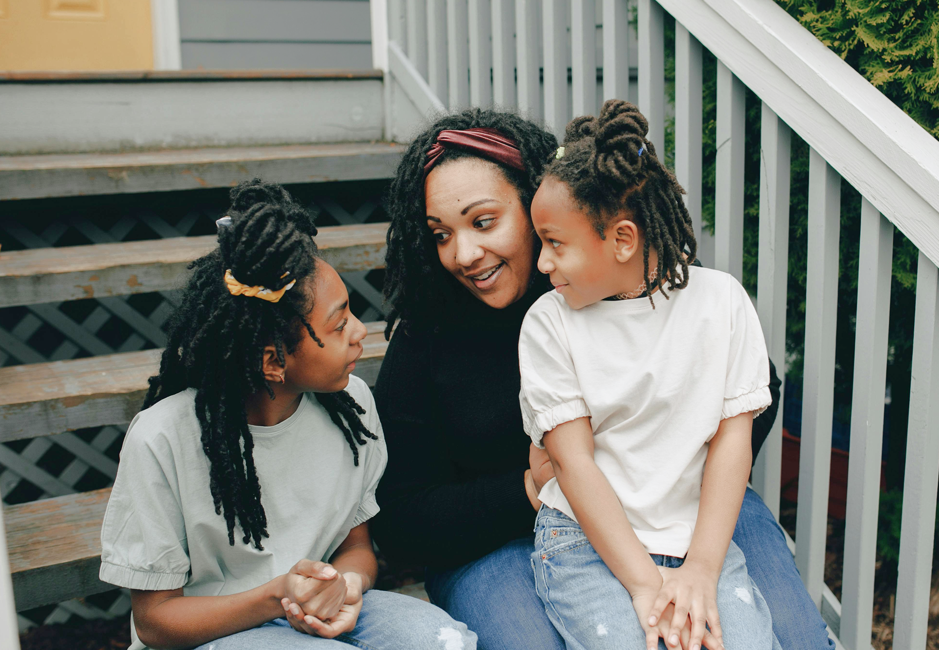
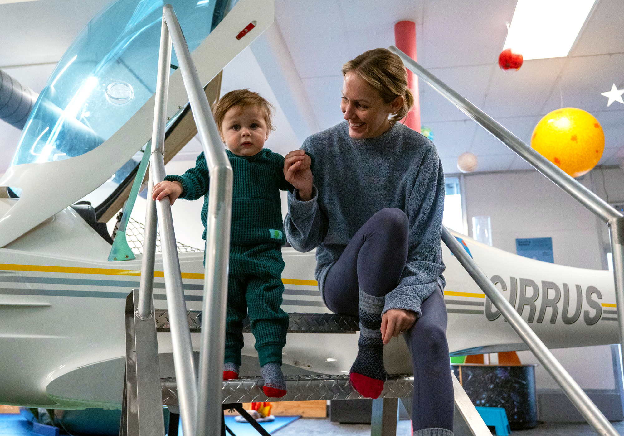
So much of the magic that happens at the Duluth Children Museum can be hard to put into words. That's exactly why we partnered with the Museum to capture some of that magic through various photo and video shoots. During these, we aim to showcase their exhibits, learning lab, and play areas, as well as the wholesome, engaging experiences childcare providers can expect from the Museum. Additionally, the final videos we edited, allowed Executive Director, Drew Jensen, to speak to key values like the Museum's STEM-focus, new programs, and their rental space.


What they said and how they felt


What they said and how they felt
More of what we have made

Duluth Playhouse | Rebrand + 2022-23 Season

Brightwater Health


