

Yellow Leaf Mental Health Facility
Yellow Leaf Support Center
Health & Wellness
What We Made
Branding Identity
Brand Guidelines
Brand Strategy
Logo Design
Naming
Interior & Exterior Store Design
Tags
Challenge
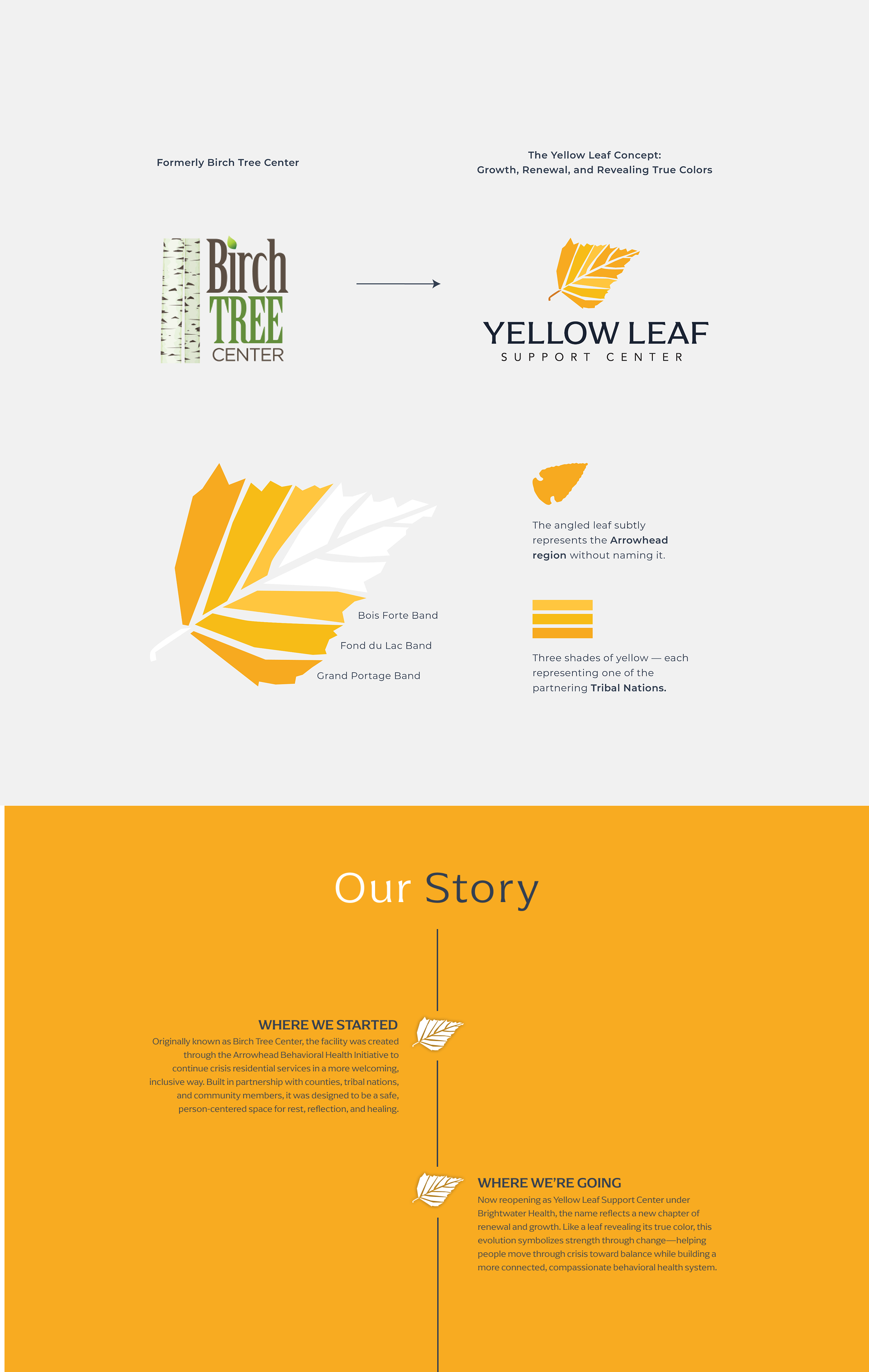
Yellow Leaf, formally Birch Tree Center, provides residential crisis stabilization to adults experiencing a mental health crisis or emergency. This includes programming designed to enhance psychiatric stability, personal and emotional adjustment, and the necessary skills to return to a more independent setting. The physical Birch Tree Center the organization was leasing space in was being sold and they were forced to change their name. Since their name would need to change, they want to explore creating an entirely new brand identity system.
Concept
The concept for the Birch Center's new name, Yellow Leaf, honors its original name while embracing cycles found in nature. This transformation, in the form of fall leaves, represents a return to a natural state, echoing the Center's mission to support individuals in crisis to regain balance. The Yellow Leaf branding features a unique yellow leaf icon, with veins representing the six counties and three tribes the organization serves. The leaf's angle symbolizes the Arrowhead region, subtly connecting to the Center's roots without explicitly stating it.
Outcome
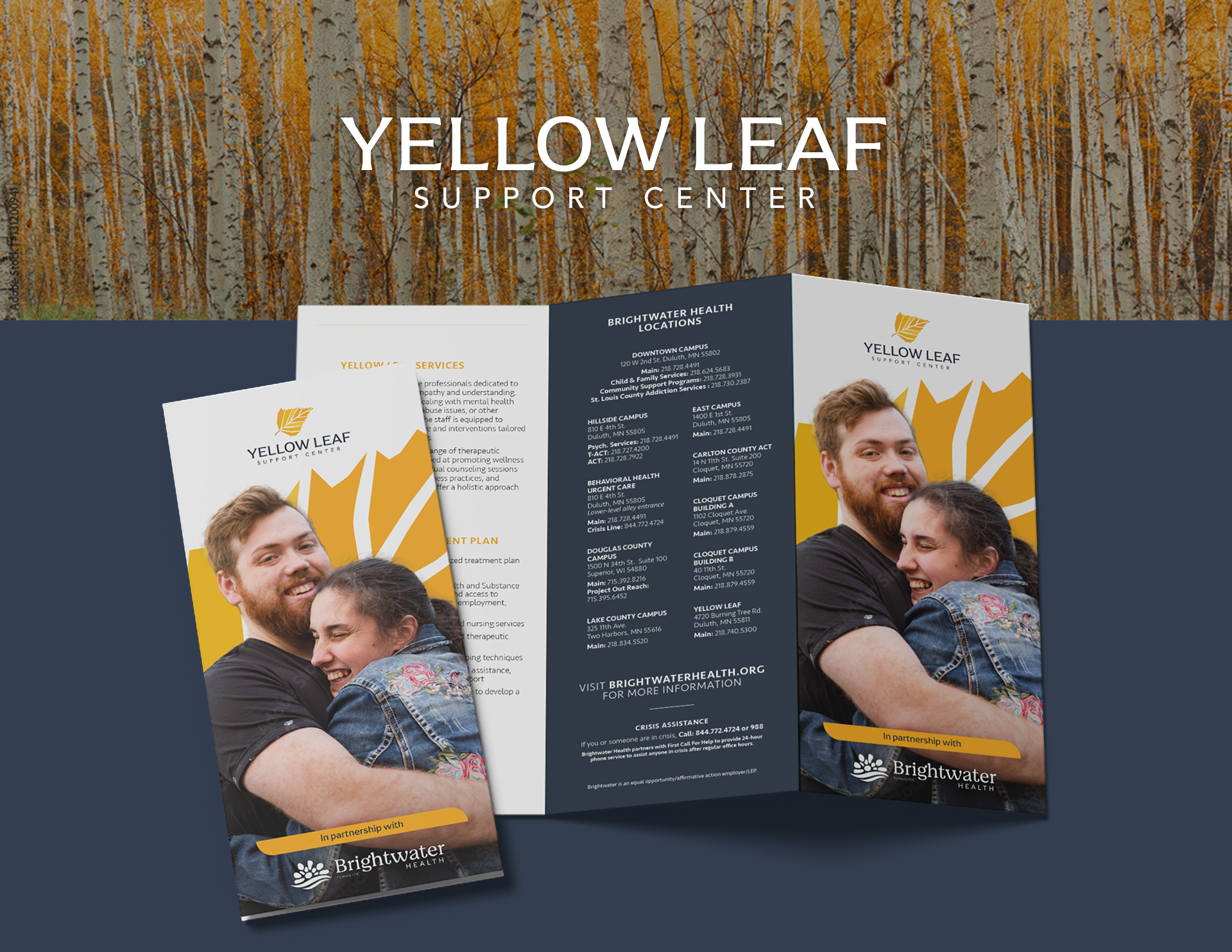
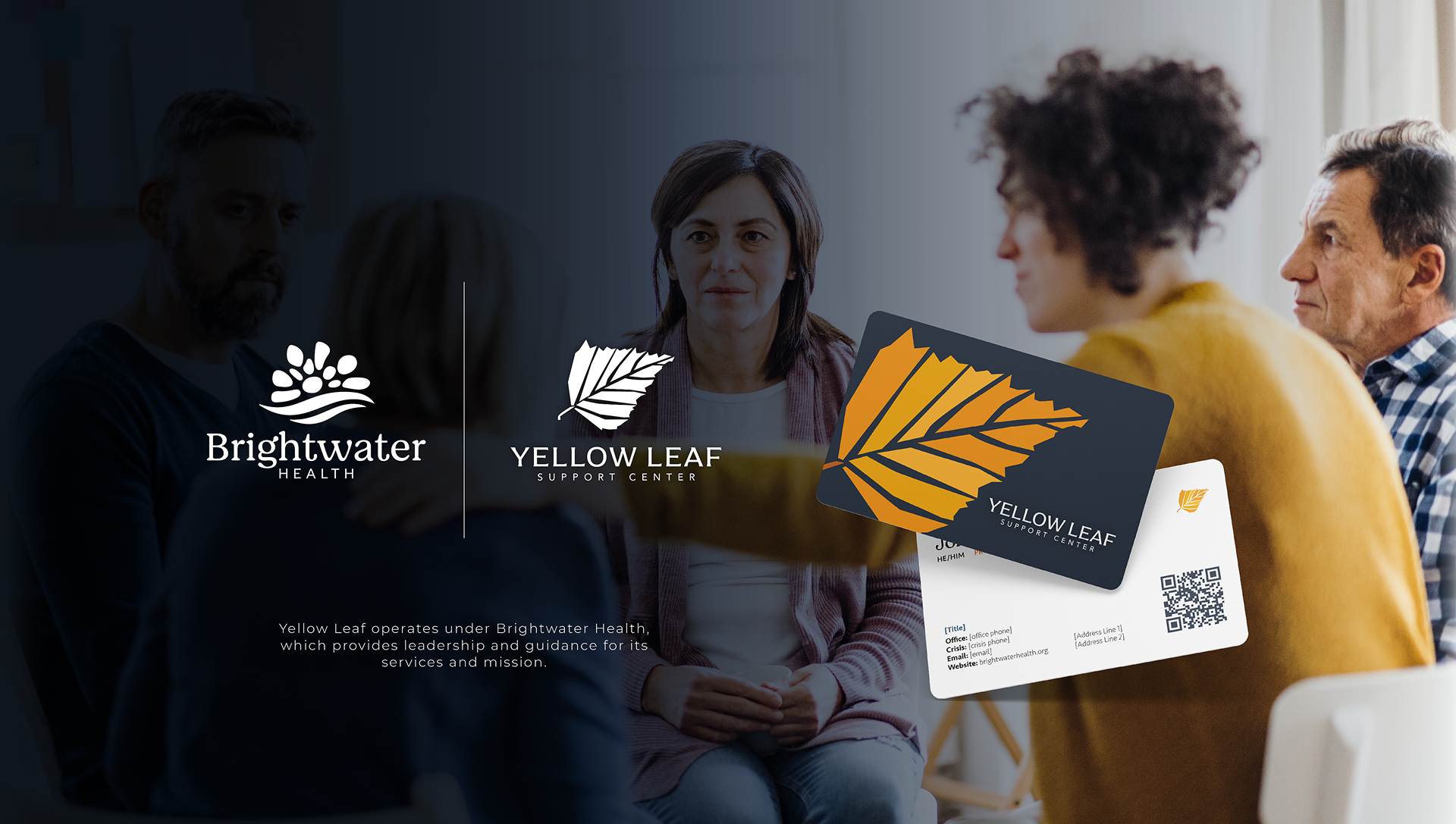
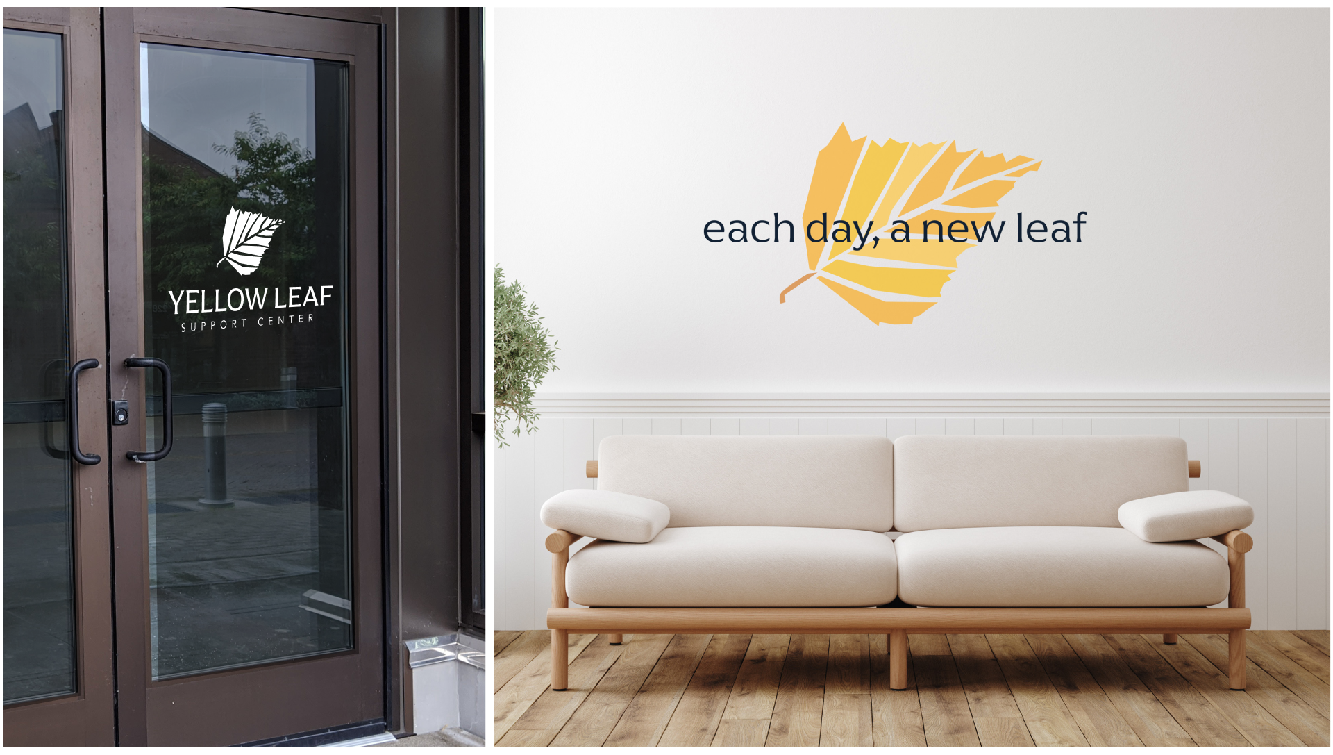
The Yellow Leaf brand and logo was built with flexibility in mind. The organization will need to use the new branding across a variety of mediums while keeping the brand visual representation intact. Because of this, we create multiple logo variations: stacked, horizontal, just as a wordmark, just the icon, etc. This equips the organization to be able to keep their brand looking consistent and credible.
Turning a New Leaf
The rebrand from Birch Tree Center to Yellow Leaf marked both a fresh start and a meaningful evolution. Rooted in nature and transformation, the new name honors the organization’s past while symbolizing renewal and balance—reflecting its mission to help individuals in crisis regain stability. The visual identity centers on a distinctive yellow leaf icon, with veins representing the six counties and three tribes served, and a subtle nod to the Arrowhead region. Designed for flexibility, the brand system includes multiple logo variations to ensure Yellow Leaf’s presence remains consistent, credible, and adaptable across every medium.

What they said and how they felt

What they said and how they felt
What they said and how they felt
What they said and how they felt

What they said and how they felt
What they said and how they felt
More of what we have made

DLH Clothing

Montgomery Sports Foundation
